flat_eric
Alfred Walker (16)
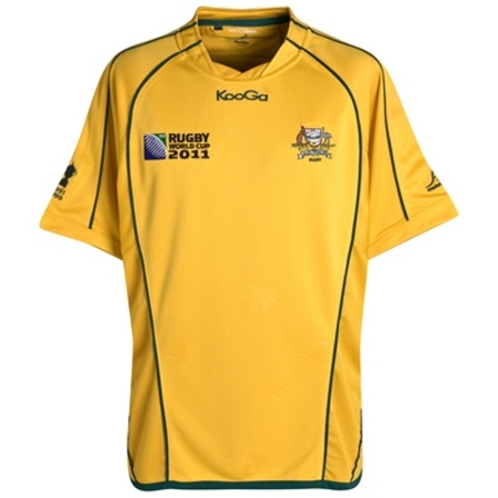
The only decent Australian national team jersey to be released this year:


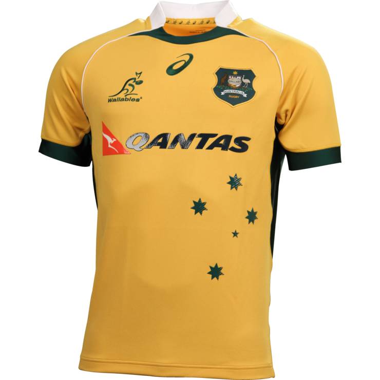
Sign a global apparel company who have been doing kit design for the better of a century and you are likely to get something decent. Kooga and ASICS are not in the same ballpark as Nike and Adidas. You can clearly see the difference in rugby kits all over the world.
Sign a global apparel company who have been doing kit design for the better of a century and you are likely to get something decent. Kooga and ASICS are not in the same ballpark as Nike and Adidas. You can clearly see the difference in rugby kits all over the world.