• Welcome to the Green and Gold Rugby forums. As you can see we've upgraded the forums to new software. Your old logon details should work, just click the 'Login' button in the top right.

World Cup Jerseys 2011

Status
Not open for further replies.

grievous

Charlie Fox (21)
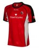
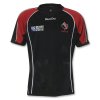
Wallabies RWC2011- Home & Away Jerseys

Home:
IMG_8934.JPG


Away (Biggest picture I could find):
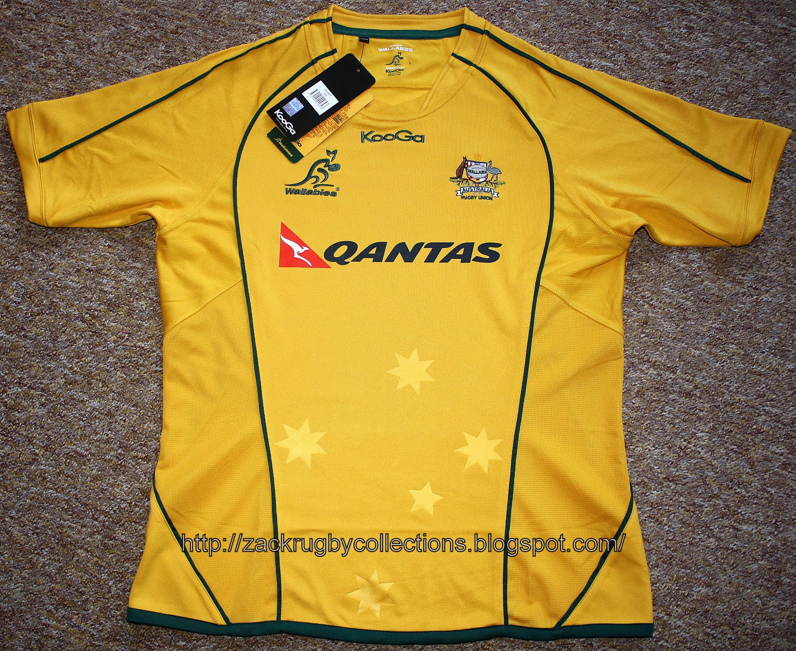
223123-white-jersey.jpg


Home & Away:
142247-wallabies-jersey.jpg


I really, really hope they don't wear that abomination of an alternate strip. I honestly think a better alternative would be like the Socceroos, going all blue with yellow trim (see bottom of the page). I also don't understand the need for so much green piping. Have some down the sides and near the sleeves, but it doesn't need to look like a jigsaw puzzle.

Socceroos Alternate Strip:
Socceroos%20Away%201012.jpg

I agree, I HATE WHEN THEY USE WHITE!!!. The Socceroos onewas just embarrassing, listen you designer twats, our colours are Green and Gold, repeat after me, get over it and use them.
 

Groucho

Greg Davis (50)
well if you think its just "sports equipment" look at the AFL and NRL and NFL and MLB and NHL and NBL......

Its not about "just" being "sports equipment" its about the look of the sport, what that sport means to its fans, being able to show off the sport to others. That look is developed oover the years in ther garments the sportsman wears when playing.

a collar and none of this subtle sublimated "grip pad" shit and its all fine. Doesnt even have to be a real collar, the priest collars are by far the best collar to have. thats all they need.

I don't disagree with any of that, however these jerseys do all these things. The people who are objecting to them, are objecting on fashion grounds. Just like people objected to the new lightweight materials, even though they provide a performance advantage.

I'm pleased you mentioned the sporting acronyms you did. All of them have been at the forefront of high-performance materials usage and progressive visual design. Rather than try to fit in with what fans have liked in the past, they've forged forward. And then, when the dust has settled, suddenly the new designs are fashionable. Why? Because fashion is about group-think. People like the kit because they see their heroes playing in it.

Irish kids won't be shunning the Ireland jersey because of the hexagons. Instead, they'll be demanding the hexagons! Their middle-aged dads might shake their heads, but soon enough they'll be wanting the hexagons too.
 

DPK

Peter Sullivan (51)
Groucho, you seem to have a way with words: surely you know that none of those were acronyms?
 

Groucho

Greg Davis (50)
The people on here getting all worked up about colours and piping are like a cross between Grumpy Old Men and Absolutely Fabulous :lmao:
 

Nusadan

Chilla Wilson (44)
I agree, I HATE WHEN THEY USE WHITE!!!. The Socceroos onewas just embarrassing, listen you designer twats, our colours are Green and Gold, repeat after me, get over it and use them.

Historically, blue and gold are the heraldic colours of the coat of arms, and it was only in 1984 green and gold were officially proclaimed the national colours.

Should a third colour be required for 'away' strips, I'd go for blue over white...hence the Socceroos' blue strip.
 

Top Bloke

Ward Prentice (10)
That dark scot jersey has to be a training one. I mean black and gold? (at least thats what it appears to be on my work monitor) can't they just stick with the purple and white?
It isn't Black and Gold - Its Navy Blue and Gold trim.
 
B

Braveheart.

Guest
Screw "Bring Back Bill"

Our new slogan should be "Bring Back Collars"
 

Sir Arthur Higgins

Alan Cameron (40)
Canada Alternate
The main jersey, red one, obviously won't have Trafigura on it. same colours tho.
 

Attachments

  • 26079.jpg
    26079.jpg
    130.2 KB · Views: 242

waratahjesus

Greg Davis (50)
Will once again be picking up the Canadian jersey, got them all but still only wear my 1995 multiple colored maple leaves one.
 

Sir Arthur Higgins

Alan Cameron (40)
that was the best one...back when rugby jerseys were still sweet!
the 'home' jersey is a good one this time around. for years they resisted the modern fabrics and styles and held on with barbarian jerseys which were usually pretty ugly.
just ordered mine and will be wearing it up on the gold coast when the boys give the barbarians a run

looking at it and the wallabies jerseys, they are actually pretty much identical designs....colours aside of course.
 

redsfanatic

Peter Burge (5)
I agree with you in regards to the style of jerseys these days and their lack of 'collars' or whatever...

But I think the only thing letting them down at the moment is the designs, which could be better...

I know I've already mentioned it twice but the overall French kit for the past couple of years was great, but they've ruined it with this new one...

By the way, here's the proper Ireland RWC kit:

index.php

This jersey is still terrible. The designers would have to be absolute pronks not to notice how ugly it is and how close it is to a bra
 

Sir Arthur Higgins

Alan Cameron (40)
will be one of the worst ones at the cup for sure.
the rugby ball emblem in the jersey is horrid too. tough to go past the quarters looking like that.
 
Status
Not open for further replies.
Top