LeCheese
Tony Shaw (54)
Yeah, fuck World Rugby for trying to let as many people as possible easily enjoy the game!Worlds getting way to PC
Yeah, fuck World Rugby for trying to let as many people as possible easily enjoy the game!Worlds getting way to PC
Your team runs to the left or to the right of the screen it’s not hardYeah, fuck World Rugby for trying to let as many people as possible easily enjoy the game!
Possibly the most reductionist statement I've ever read about rugby.Your team runs to the left or to the right of the screen it’s not hard

Thumbs down emoji!I'd like to see a dark blue jersey with the Union Jack and six white stars. Something like this:
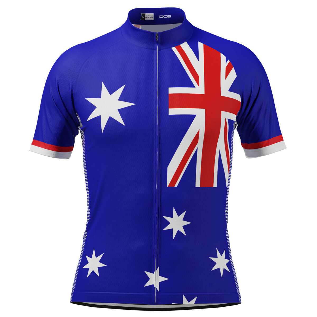
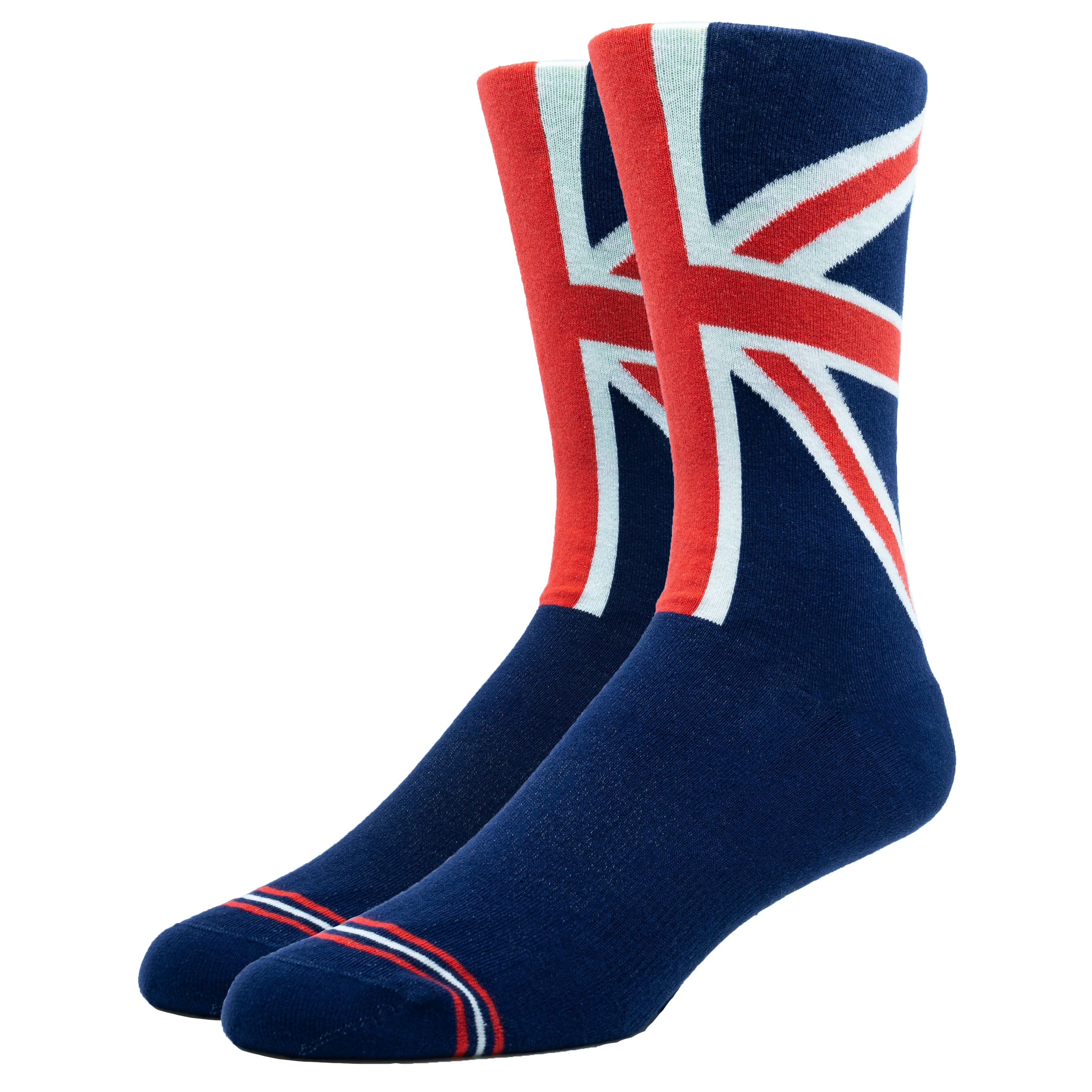
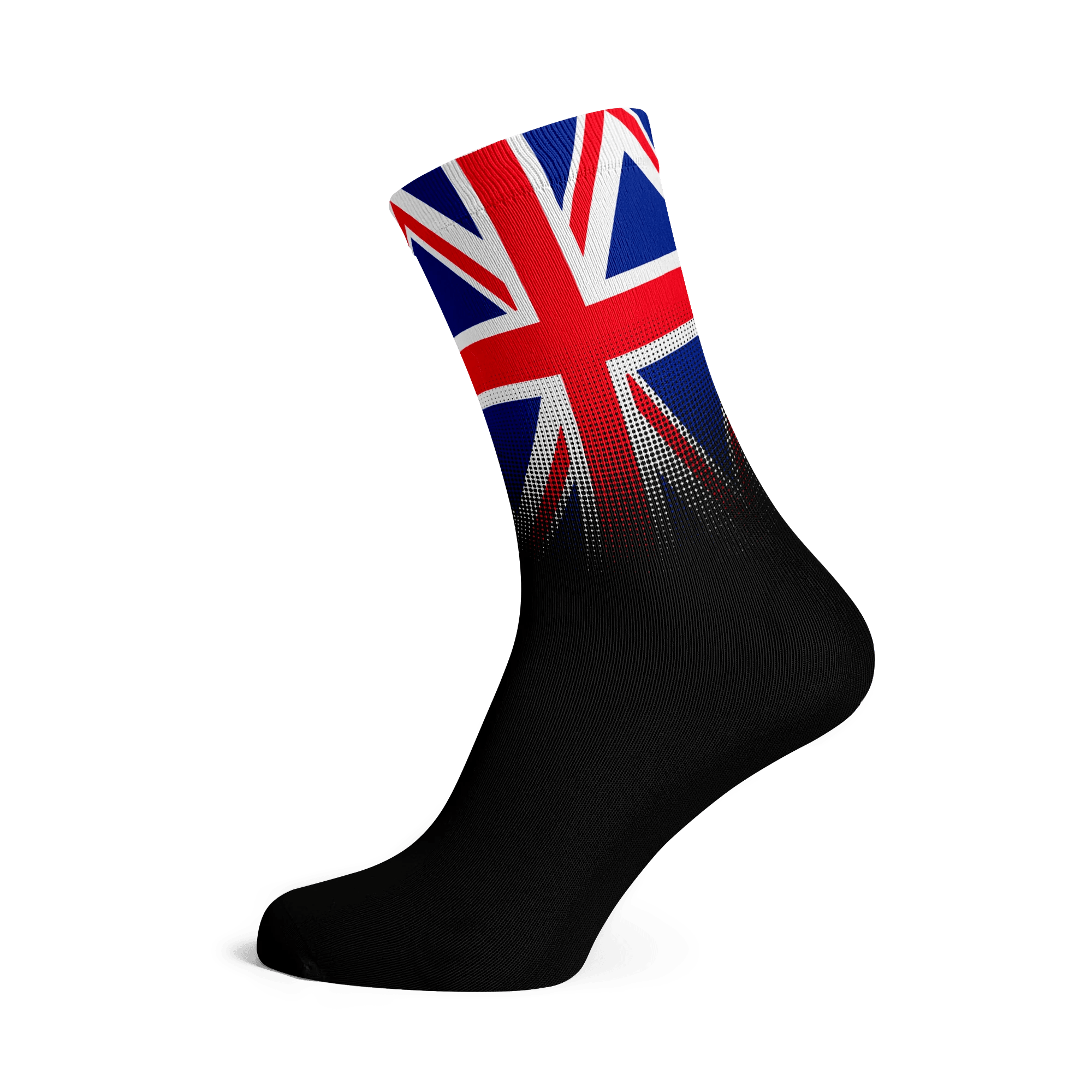
With dark blue shorts and socks with Union Jack design:
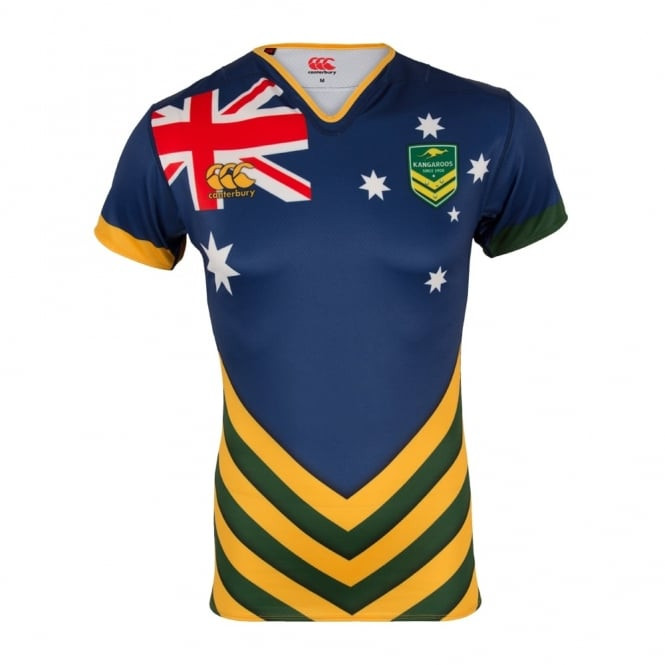
I remember the 2016 Kangaroos training shirt with something similar:
This right here is the most obvious solution to the problem - make the away jersey hooped. In this instance they perhaps should have gone green and white or something, but as long as they are 2 contrasting colours it solves the issue right?View attachment 16818
I’m not mad at this.
It would but they would look like soccer players. Hoops is the answer.I am a fan of molman’s and Raelenes ones. also, would one team in a striped uniform help with the colour blind?
I stand corrected, meant hoops. Vertical stripes don’t work in rugby, fact.It would but they would look like soccer players. Hoops is the answer.
This is very interesting. I don’t have to deal with it but wouldn’t Hoops regardless of colour eliminate the issue because you can identify the pattern. As long as you know which team has the hoops then it’s all good?Possibly the most reductionist statement I've ever read about rugby.
Last thing I'll say given the thread - 1 in 12 males are colour blind. Have a look at these examples below and see if you still think it'd be easy viewing. The last one serves as an example of the impact of good contrast, as well as how match officials need to be considered.
View attachment 16819View attachment 16821
View attachment 16820
View attachment 16822
View attachment 16823
The issue now is you turn on the game and nobody recognises the team as everyone else is now in white. Where nobody but England wore it beforePossibly the most reductionist statement I've ever read about rugby.
Last thing I'll say given the thread - 1 in 12 males are colour blind. Have a look at these examples below and see if you still think it'd be easy viewing. The last one serves as an example of the impact of good contrast, as well as how match officials need to be considered.
View attachment 16819View attachment 16821
View attachment 16820
View attachment 16822
View attachment 16823
The issue now is you turn on the game and nobody recognises the team as everyone else is now in white. Where nobody but England wore it before
Your team runs to the left or to the right of the screen it’s not hard
In seriousness though, I understand your point from an 'identity' perspective - however no one is proposing clash strips be worn all the time, and ultimately I think that making the game accessible to fans holds greater importance.The issue now is you turn on the game and nobody recognises the team as everyone else is now in white. Where nobody but England wore it before
That's cause on the props they bendWe need that colourblind filter on the Force heritage jersey in a game, or Waikato (I think) in the NPC.
I stand corrected, meant hoops. Vertical stripes don’t work in rugby, fact.
Just forcing sides into plain white kits for the World Cup is shambolicIn seriousness though, I understand your point from an 'identity' perspective - however no one is proposing clash strips be worn all the time, and ultimately I think that making the game accessible to fans holds greater importance.
It's also no different to having a home and away strip, which has been happening for the best part of forever.
Just forcing sides into plain white kits for the World Cup is shambolic
Your understanding is misguided - the teams are free to determine their own alternate/clash strip, so long as it meets the broadcast requirements, which have/will be extended to include considerations of colour blindness. Aus nominated white as their alternate/clash strip - they don't have to be 'plain white'.Just forcing sides into plain white kits for the World Cup is shambolic
World Rugby made a range of recommendations for the 2023 World Cup, on the back of tests of kit for broadcast quality made earlier this year.
In this routine process, unions submitted their primary and secondary kits – in some cases using designs not yet launched to the public – to be looked at in the French stadiums, under floodlights and daylight conditions.
This is normally aimed at picking up clashes of the same colour or tone that make TV viewing difficult, but this time World Rugby considered colour-blindness problems too.
All the combinations of team kits were compared, together with referees’ kits, and after further analysis, certain unions were asked not to play in their primary kit. The requests included changes of socks.
There is an operational list of “Team A” and “Team B” for each World Cup match, and Portugal as “Team A” versus Australia had first choice of kit.
With various types and severities of CVD, and consequently a range of problems with combinations of colours or shades, it is understood the relevant imagery showed the Portuguese jersey had a yellowish tinge that raised a colour-blindness issue.
World Rugby has said, of the 250 million unique viewers who watched the 2019 Rugby World Cup held in Japan, approximately 12.9 million would have had some form of colour blindness, based upon a 62:38 male-female spectator profile.
Not really - colours at a distance all blend in for me......This is very interesting. I don’t have to deal with it but wouldn’t Hoops regardless of colour eliminate the issue because you can identify the pattern. As long as you know which team has the hoops then it’s all good?