You are using an out of date browser. It may not display this or other websites correctly.
You should upgrade or use an alternative browser.
You should upgrade or use an alternative browser.
ASICS partners with Australian Rugby Union from 2014
- Thread starter GaffaCHinO
- Start date
- Status
- Not open for further replies.
T
TOCC
Guest
Yeah, it's simple and modern without completely ditching the traditional aspects...
GaffaCHinO
Peter Sullivan (51)
May see the return of chest hair with that v necknew asics springbok jersey. Thoughts?
Sent from my iPhone using Tapatalk
Bairdy
Peter Fenwicke (45)
Not bad, not bad at allnew asics springbok jersey. Thoughts?
Sent from my iPhone using Tapatalk
TahDan
Cyril Towers (30)
I was looking for images of this and stumbled across this forum. So hi everyone ") .
.
On the jersey - I can't stand it. Completely undoes the minimalist approach the BLK had finally been getting right and replaces it with this messy mishmash of asymmetrical random green patches, white collars (seriously, when can we get back to green? BLK was halfway there at least...) and a crassly put garish southern cross.
The whole thing is just fugly beyond belief. The Springboks design is far better - it keeps in with tradition, has better shade of 'gold', and doesn't have crap all over it like the Wallabies one.
All I can say is I'm just glad I bought last year's KooGa/BLK jersey before it was too late.
.On the jersey - I can't stand it. Completely undoes the minimalist approach the BLK had finally been getting right and replaces it with this messy mishmash of asymmetrical random green patches, white collars (seriously, when can we get back to green? BLK was halfway there at least...) and a crassly put garish southern cross.
The whole thing is just fugly beyond belief. The Springboks design is far better - it keeps in with tradition, has better shade of 'gold', and doesn't have crap all over it like the Wallabies one.
All I can say is I'm just glad I bought last year's KooGa/BLK jersey before it was too late.
p.Tah
John Thornett (49)
TahDan, how long have you been working for BLK?
I don't mind it.
Noticed on the Asics site they have the traditional collar version as well. I prefer the match jersey
http://www.asics.com.au/by-product/...DITIONAL-LONG-SLEEVE-JERSEY/p/0010220712.1002

I don't mind it.
Noticed on the Asics site they have the traditional collar version as well. I prefer the match jersey
http://www.asics.com.au/by-product/...DITIONAL-LONG-SLEEVE-JERSEY/p/0010220712.1002
Slim 293
George Smith (75)
Nah, the Kooga/BLK designs were all terrible....... The green piping, followed by the diagonal green line that looks like they forgot to finish designing it were utter gash.......
Asics have finally brought us a good, simple design.......
And the white collar adds a nice contrast, because green and gold is sometimes not the most visually pleasant colour scheme.........
It's essentially a copy of the early-mid 200s CCC jersey, and that's not such a bad thing..........
In fact, I'm not sure if there's a single Kooga/BLK designed jersey in world rugby that's been any good........
TahDan
Cyril Towers (30)
TahDan, how long have you been working for BLK?
I don't mind it.
Noticed on the Asics site they have the traditional collar version as well. I prefer the match jersey
http://www.asics.com.au/by-product/...DITIONAL-LONG-SLEEVE-JERSEY/p/0010220712.1002
Haha if only I worked in Jersey design! I'd finally convince someone to bring back an all green wallabies jersey as an away kit at least. I know that's a random side issue, but it seriously annoys me that we dumped it for the Springboks in the 60s and we won't even consider an away kit... heck half the 6N and Super Rugby all wear shades of blue, why can't Aus have an alternate green kit?
Anyway, the ASICs springbok is brilliant and shows how it SHOULD be done. The Wallabies jersey by comparison has no style... that wear green panel connecting the white collar is awful, and the sleeves with green trimmings has been done to death (but was still done better with the '03 CCC jersey), but now it's a weird spilt paint look.
I also don't like the southern cross being splashed all over it like some bogan tattoo. Embossing it was a much classier way to go.
Personally, I just can't find anything good to say about it. Even the shade of yellow is just awful... it's that crap pale yellow they were supposed to have gotten rid of.
In sum, I'd say this is the worst kit since '97.
TahDan
Cyril Towers (30)
Nah, the Kooga/BLK designs were all terrible... The green piping, followed by the diagonal green line that looks like they forgot to finish designing it were utter gash...
I hated that first one with the green piping - it was awful (and I should point out that there's white piping on this one). But the last one was definitely on the right track. I didn't mind the touch of green on the left - it was the only modern flicker in an otherwise completely retro nod to the classic late 80s early 90s minimalist designs.
Asics have finally brought us a good, simple design...
How can you call THAT simple? it's a bloody mess! There's more going on in it than a jackson pollock! Weird green slivers the slide up from the sleeves, another weird green patch under the collar that looks like someone cut out a pair of green speedos, and then a southern cross smacked randomly down the side of the torso...
I don't like the white collar either - it's another pet peeve of mine. Australia's colours aren't Green, Yellow, white and Navy, they're Green and Gold. So they should also cut it out with all the navy training gear.
TahDan
Cyril Towers (30)
Most teams use a different colour for their training gear...
The All Blacks have used red and green for their training jersey...
And blue has previously been one of Australia's national colours...
But not anymore. They're now green and gold, and the simplicity of using those colours is what made that late 80s and early 90s design so classic and pleasing. It was simple; no white piping sliding from a white collar, no strange green panels smattered in random and ugly ways, and no bogan style SC.
Seriously, the only jersey that has been more incoherent and lacking direction in its design is this one (Kearns' face say it all):

Slim 293
George Smith (75)
Nah, the CCC 2007 jerseys with the white mesh were putrid, and the Kooga designs that followed were just silly........
This Asics jersey is a return to form.........
I agree about the southern cross stars being gold, and it's not perfect........ but otherwise it's a simple, classic design..........
And that tiny bit of white works with it.........
This Asics jersey is a return to form.........
I agree about the southern cross stars being gold, and it's not perfect........ but otherwise it's a simple, classic design..........
And that tiny bit of white works with it.........
TahDan
Cyril Towers (30)
We'll have to agree to disagree on this one as I really do think it's up there with 97 as the most garish thing for the Wallabies to have worn.
That said, I still can't see how you can rationally argue that this is simpler than the last BLK one. It's manifestly not in any way you look at it. This:
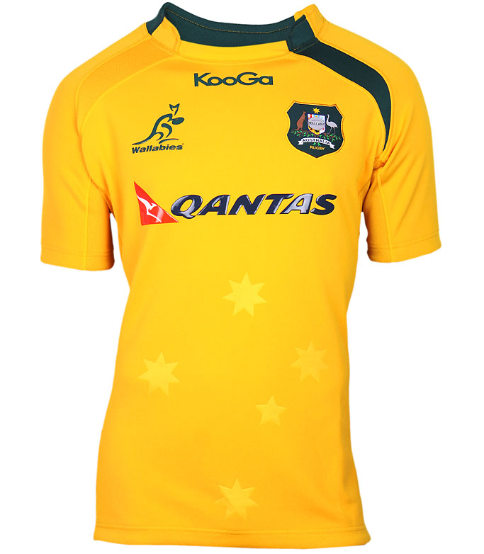
just is far simpler and more classic than:

That said, I still can't see how you can rationally argue that this is simpler than the last BLK one. It's manifestly not in any way you look at it. This:
just is far simpler and more classic than:
RugbyFuture
Lord Logo
I liked the shade of gold and return to form that the kooga ones were. Asics one I dont like the shade of gold, but in the end, its very similar to the post hooped sleeves (2003) pre-mesh canterbury ones. Not bad but not great. Side panels will make any forward look fat.
TahDan
Cyril Towers (30)
Yeah, the side panels have been going in and out of vogue since England used them in '02, but they've always looked crap in my view.
The Asics Springbok jersey shows the way. This thing is just way too busy. They need to get rid of all the green panels, SC, white piping and make the collar green. Basically, they really should have just inverted the Springbok one.
The Asics Springbok jersey shows the way. This thing is just way too busy. They need to get rid of all the green panels, SC, white piping and make the collar green. Basically, they really should have just inverted the Springbok one.
- Status
- Not open for further replies.