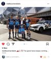
Aside from agreeing with the too many blue jerseys chat, I actually really like the light blue to navy blue transition on this jersey.
I hate that skyline print though. Not just the Rebels one, but other teams across other codes have done similar stuff over the years, always looks a bit much in my opinion. These jerseys are always the ones that pop up in salvation army shops, they don't age very well compared to the other more traditional styles.
It looks like you could flatten them out, cut the top off and hang them in the reception of an office somewhere.


